A Cherry Pop Events guide to making your party pop—without clashing like ketchup and cranberry
Well hey there, honey bun! You’re planning a wedding, a shower, or a bash-of-the-century and thinking, “I’ll just pick my favorite colors and call it a day!”
Whoa, slow your saddle shoes.
Because when it comes to event design, color ain’t just about what looks cute on Pinterest—it’s an emotional powerhouse. The wrong color combo can turn your dreamy garden wedding into a dental office disaster. But the right palette? Oh, sugar, it can sing.
Ready to become a color-savvy host with style and sass? Let’s paint the town (strategically).
💋 First: Why Color Matters Emotionally
Color sets the tone of your event before guests even park their polka-dot pumps.
- Red = Passion, excitement, energy
- Blush/Pink = Romance, femininity, sweetness
- Blue = Calm, trust, serenity
- Green = Fresh, earthy, harmony
- Gold = Glamour, celebration, old-school luxe
- Black = Sophistication, drama, edge
Cherry Pop Tip: Ask yourself, “How do I want my event to feel?” That answer is your color compass, cupcake.
🎀 Want help translating feelings into color palettes? That’s our specialty, sweetheart. Book a design consult and we’ll turn your mood board into a masterpiece.

🧁 Color Pairing: Where Magic—or Mayhem—Happens
Colors aren’t solo artists—they’re in a band. And just like rock ‘n roll, the harmony can be glorious or garbage.
🎯 Great Combos That Slay (and Why)
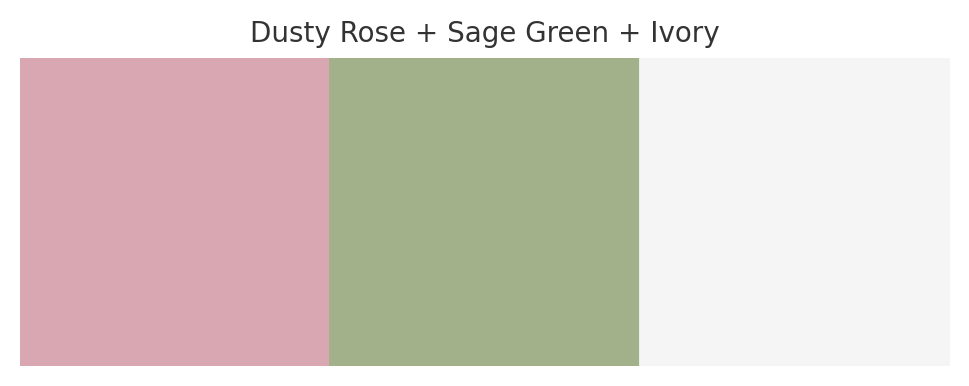
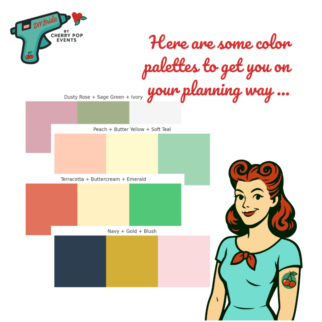
Dusty Rose + Sage Green + Ivory
Why it works: Soft, romantic, grounded. Think vintage love letters and garden cocktails.
Perfect for: Boho weddings, backyard brunches, feminine birthday bashes.
Navy + Gold + Blush
Why it works: Masculine meets glam. Classic with a twist.
Perfect for: Evening weddings, cocktail events, retro-chic engagements.

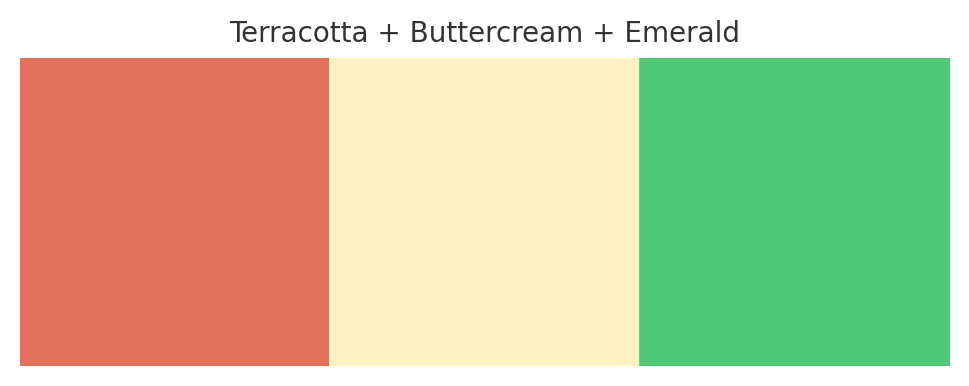
Terracotta + Buttercream + Emerald
Why it works: Earthy warmth meets rich jewel tones. Totally 2026.
Perfect for: Fall parties, elopements, desert-inspired vibes.
🛑 Combos to Rethink (Trust Us)
- Red + Bright Green
Unless it’s a Christmas party, back away slowly. It screams Santa, not sophistication. - Purple + Neon Yellow
We’re planning a wedding, not launching a rave in 1997. - Pastel Everything + Bright Orange Accent
Clash city. No one invited a traffic cone to your bridal shower, babe.
Color is emotional—but it’s also technical. Different hues affect each other. Warm tones (like coral) can make cool tones (like lavender) look dusty. Light colors can wash out in photos. Metallics can clash if they don’t play nice.
💄 Not sure if your combo is couture or catastrophe? Cherry Pop Events can help pick palettes that pop, not flop.
🌈 Color Strategy by Event Type
Let’s talk real-life use cases, sugar.
💍 Weddings
- Want romance? Blush, soft mauve, gold accents.
- Want drama? Black, deep burgundy, velvet textures.
- Want clean elegance? Ivory, sage, soft gray, maybe a pop of copper.
🎀 CTA: Don’t just chase trends—make your own color story. Let’s build it together.
🎂 Birthday Parties
- 21st Birthday? Jewel tones + glitter = glam slam.
- Backyard bash? Peach, butter yellow, soft teal—dreamy and daylight-friendly.
- 30th celebration? Champagne + white + metallics. Timeless, but not boring.
🎉 Themed Events
- Vintage Tea Party? Mint, dusty blue, floral prints.
- Disco Night? Silver, hot pink, black, LED accents.
- Tropical Bash? Coral, palm green, sandy beige, and yes, flamingos are welcome.
Sassy Rule: Match your colors to your theme, your venue and your lighting. One wrong bulb and your elegant ivory might look like hospital beige. Yikes!
👠 Quick Color Planning Tips (For My Darling Novices)
- Start with 2–3 core colors
Don’t get greedy, sugar. More than 4 colors = chaos. - Balance bold with neutral
You can’t have 3 loudmouths on stage. Someone’s gotta harmonize. - Consider the venue’s colors
Ugly red carpet? Clashing curtains? Work with it or cover it. - Test under different lighting
Sunlight vs. candlelight changes everything. - Think of the photos
What looks cute in person can look weird in pictures. Trust me, I’ve seen it all.

🎉 Final Word from Your Favorite Retro Color Queen
Color isn’t just eye candy—it’s emotional architecture. It holds your event together, tells your story, and sets the mood from the first sip to the final shimmy on the dance floor.
And while Pinterest boards are pretty, they don’t know your vibe, venue, lighting, or personality like I do.
So if you’re ready to move from confused to confident in your color game—honey, let’s make magic.
Book a Cherry Pop Events consultation and let’s swatch, sip, and sass our way to your perfect palette.

Leave a comment